Every element on a product page influences whether a user keeps scrolling, stops to read, or clicks the “Buy” button. It’s not just about having the right blocks, but also how they’re arranged, how clearly the information is presented, and how easy it is to navigate.
In this article, we’ll break down the key elements that make an effective product page, show how leading eCommerce brands implement them, and share practical ideas you can apply using JetWooBuilder. This will serve as your foundational guide if you’re building from scratch or improving an existing store.
What Is a Product Page?
A product page, often referred to as a product-detail page (PDP), is the single point in your store where browsing stops and a purchase decision begins. It’s one of the most important parts of any online store. This page provides users with all the necessary information about a product, including its name, price, images, description, options, reviews, and instructions on how to purchase it. It is like the digital version of a shop assistant. It should answer common questions, such as: What does this product look like? Is it in stock? How much is shipping? What are other buyers saying about it?
If something is missing or unclear, many users will simply leave, resulting in lost sales. That’s why the design and structure of your product page matter so much. A clean layout, high-quality photos, clear details, and a strong call to action can make the difference between someone making a purchase and someone likely to bounce.
Why Great Product Page Design Drives Profit?
Essentially, this is the page where traffic is converted into revenue. You invest in ads, drive people via social media, SEO, email campaigns, and all of it leads to one crucial point: the product page. If it doesn’t convince, everything else falls flat.
A well-designed product page is where:
- the final purchase decision is made;
- the customer’s impression of your brand is formed;
- trust in your store is either built or lost.
Design directly affects how a product is emotionally perceived. The layout, colors, typography, and presentation of the content and images all either increase or decrease shoppers’ desire to buy. Additionally, a well-structured product page simplifies analytics. You can clearly track which elements are working, where conversions drop off, and what needs further testing. That creates opportunities for ongoing optimization, and with it, steady revenue growth.
Essential Anatomy of a High‑Converting Product Page
Every product page is unique to the brand and target audience, and high-performing layouts consistently rely on several core elements. These components work together to inform, persuade, and guide the user toward making a confident purchase decision.
Below is a breakdown of the most essential elements that transform product pages into revenue engines, accompanied by real-world examples and explanations of why they are effective.
Element #1: high-quality product visuals
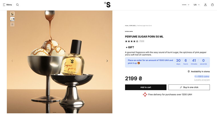
Just take a look at how Sister’s Aroma showcases its products. Each photo feels like a piece of visual storytelling: the bottle paired with fruits, pastries, or rich textures that reflect the scent itself. Their images are so vivid and thoughtfully composed that it’s hard to scroll past without instantly wanting to try the product. You see the gloss of the glass, the structure of the label, and the personality of the fragrance – all before reading a single line of text.
Why it’s essential:
Shoppers need to understand what they’re buying. If the image is blurry, dark, or unhelpful, the desire to purchase drops. Product pages without strong imagery often fail to convert because users can’t picture themselves owning the item. A well-shot image sets expectations, reduces doubt, and increases emotional engagement, making it one of the most essential elements of any high-converting product page.
Element #2: real-motion visuals or interactive media
A good example of this is product pages on Answear, where, alongside high-quality images, you’ll also find a short product video. It shows the model moving in the jacket, turning, and walking, with nothing overly produced or photoshopped – just clean, honest footage.
For fashion products, this is especially important. However, these types of interactive formats are equally effective in other industries as well. For example, in the tech or jewelry industry, zoom-on-hover or 360° views can be used, while eyewear brands can offer virtual try-ons via smartphone cameras. This way, the shopper can “put on” the product and instantly see whether the shape, size, or color suits them.
Why it’s essential:
These formats reduce the distance between the product and the user. The person isn’t just looking at a photo; they are virtually interacting with the product. This creates an emotional connection, builds trust, and gives a clear understanding of the product before purchase. If the user can see how the item looks “in real life,” they hesitate less, make decisions faster, and are less likely to return the product.
Element #3: clear product title, description, and visible pricing
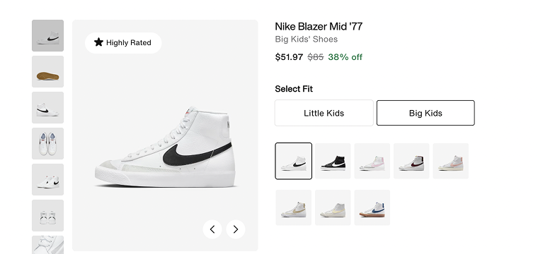
A clear and prominent product title, a structured description, and visible pricing are essential elements for any product page. Nike’s product pages provide a great example of this. The product name is bold and largest, immediately informing users what they’re viewing. Below it, the category label, price, fit options, and additional details are organized in a clear hierarchy. The description is brief and informative, providing shoppers with the key details they need without cluttering the page.
Why it’s essential:
Without a clear product name and organized information, users can quickly become confused or uncertain about what they’re buying. A structured title and description build trust and confidence by helping shoppers understand exactly what they’re looking at. A clear hierarchy makes the page easy to scan, reducing hesitation.
Element #4: “Add to Cart” button
If your product page doesn’t have an “Add to Cart” button, then what’s the point of having the page at all? This button is the most important element because it completes the customer’s journey from interest to purchase. The buyer has already made their decision – all that’s left is to confirm it with a single click.
Why it’s essential:
Without a clear, visible, and easy-to-use “Add to Cart” button, shoppers can become confused or lose motivation. If users don’t see how to quickly and simply place an order, they’re likely to leave your site and go to a competitor. The button needs to stand out, be interactive, and create the feeling that buying is a quick and effortless step.
Element #5: customer review section
The review section provides real social proof from people who have already purchased and used the product. Authentic reviews show potential buyers that others have had positive experiences or at least honest opinions. A well-designed review section includes not only star ratings but also detailed comments and user photos. Don’t forget to add the review form so customers can submit their feedback.
Why it’s essential:
Without reviews, users may hesitate, doubting the product’s quality or fearing a wrong choice. Reviews create transparency, reduce perceived risk, and make the buying process more human. They serve as powerful social proof that often becomes the deciding factor between adding a product to the cart or leaving the site.
Element #6: product variations and availability status
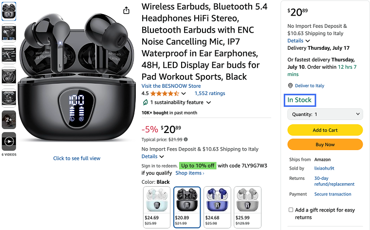
One of the most important (too often underestimated) elements on a product page is the ability to easily select a variation (color, size, format) and immediately see if it’s in stock. Users don’t want to guess, reload the page, or search elsewhere. They want to clearly understand which option suits them and whether they can buy it right now. On Amazon product pages, this is handled perfectly: you can quickly choose a color or style, each variation has its own preview, and the price updates instantly, accompanied by a clear “In stock” label.
Why it’s essential:
If product variations are hard to find or it’s unclear what’s available, it creates friction. Accessible information about available options and their stock status reduces hesitation and improves the user experience. Shoppers need to instantly see which size, color, or format is in stock.
Element #7: shipping information
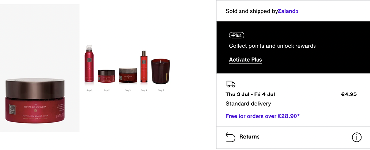
All information related to shipping should be clearly visible (delivery times, costs, and available options). On Zalando’s product pages, this is handled neatly: next to the product, users can instantly see both standard and express delivery options. Each one lists the number of days the delivery will take and the associated cost. The shopper can immediately compare and choose the option that best fits their schedule and budget.
Why it’s essential:
Clearly stated shipping details enable customers to plan their orders without needing to search for additional information. They instantly see the full picture of timing and cost, which streamlines decision-making and reduces the need for support contact.
Element #8: cross-sell/upsell suggestions
Relevant product recommendations are a smart way to enhance the shopping experience and increase the average order value, without being intrusive. These blocks usually appear under or beside the main product, suggesting items that complement, match, or are frequently bought together. On ASOS, for example, product pages feature sections like “Buy the look,” “You might also like,” and “Recently viewed.”
Why it’s essential:
Well-placed cross-sell and upsell suggestions reduce browsing time and inspire customers to explore more, especially when they’re undecided. These sections serve as a stylist or guide, offering context, combinations, or higher-value alternatives without forcing the user to search manually.
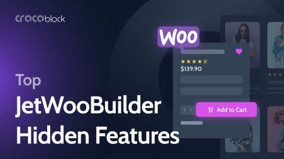
Creating a Product Page with JetWooBuilder
Let’s get to the fun part – creating a product page with JetWooBuilder.
First, go to WordPress Dashboard > Crocoblock > JetPlugins Settings > JetWooBuilder > Widgets, scroll to the Single Product Widgets section, and enable the widgets you plan to use.
Next, create a template. Navigate to WordPress Dashboard > Crocoblock > Woo Page Builder and click “Create New Template.”
Choose “Single” as the template type, give it a name (for example, “Product Page Template”), and optionally select a layout preset. Then click “Create Template” to open it in the Elementor editor.

Create your single product template using JetWooBuilder and Elementor.
Use the Elementor widgets panel to drag and drop JetWooBuilder widgets like Single Title, Single Images, Single Add to Cart, Single Meta, and others you need to show product details. Just add the widgets you want.
When you finish creating your product page template, click the “Publish” button.
Don’t forget to assign the template to WooCommerce. Head to WordPress Dashboard > WooCommerce > Settings > JetWooBuilder, tick “Enable custom single product page,” select your template in the Single Product Template dropdown, and click “Save Changes.”
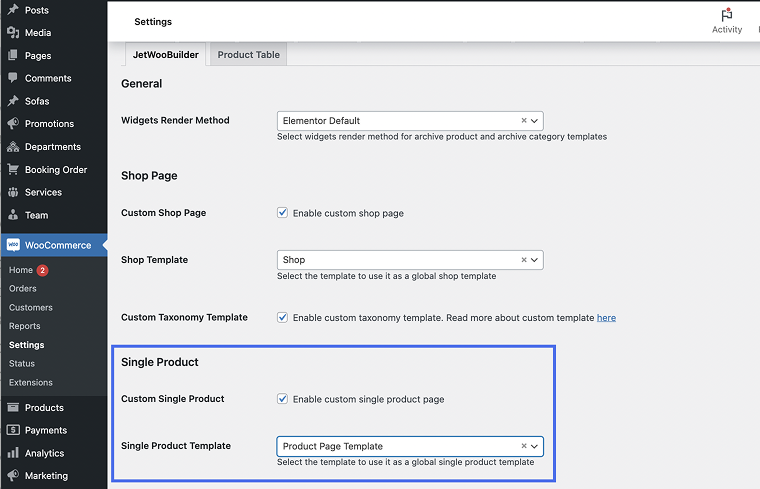
This step replaces the default WooCommerce layout with the one you have just published.
For more detailed instructions, please refer to our video:
Tips and Tricks for Product Pages
I have also prepared some practical enhancements that aren’t essential for the structure of a product page but can significantly improve usability, engagement, and conversion.
Promotions and time-limited offers
Adding promotional messages like “Buy 2, get 1 free” or showing a countdown timer for a sale creates a sense of urgency and can drive quicker decisions. Limited-time deals catch attention and make the offer feel exclusive.
💡 Use the JetEngine Dynamic Visibility module to display time-based promotions conditionally, and JetElements to show countdowns on your page.
Multiple payment methods
It’s always a good idea to offer multiple payment options (credit cards, PayPal, Apple Pay, etc.) to ensure a smooth checkout experience and accommodate user preferences across different regions. It also makes your store appear more trustworthy and professional.
“Add to Wishlist” button
This small feature gives users the option to save a product for later, especially useful for undecided shoppers or those comparing several items. It increases the chances of return visits and future purchases.
💡 Use JetCompare&Wishlist to easily add wishlist functionality to your product pages with dedicated widgets.
Social sharing buttons
Let users share your products on social media with a single click. It’s an easy way to get organic visibility and reach potential customers through peer recommendations.
Recently viewed products
Displaying items the user has recently viewed keeps them engaged and encourages them to revisit items they previously considered. It also reduces friction from navigating back and forth.
FAQ
Such elements typically include high-quality visuals, compelling descriptions, clear calls to action, customer reviews, pricing information, and stock details.
You can test different layouts, calls to action, image placements, or content variations to identify what resonates best with users.
Beyond features, effective descriptions tell a story, highlight benefits, and address customer pain points.
Takeaway
I hope these tips will be useful to you and help elevate the quality of your product page to the next level. Remember, a well-designed layout and user-friendly interface not only attract customers’ attention but also build trust and boost conversions. Don’t forget to test different elements and tailor your page to the needs of your audience.
If you have any questions or something isn’t clear, please don’t hesitate to reach out to us.