Imagine this: 7 out of every 10 potential customers leave their shopping carts behind—all because of poor design choices. According to the Baymard Institute, a staggering 70% of eСommerce visitors abandon their shopping carts. The reason? Often, it’s the web design.
If you’re managing a WordPress site, you have the power to turn this trend around. Good design is essential for delivering an experience that keeps visitors engaged and moving through the purchase process.
In this guide, we’ll break down the key principles of effective website design and show you how to implement them to create a seamless, user-focused experience.
Here’s what we’ll cover:
- User-friendly navigation: helps visitors find what they’re looking for effortlessly.
- Responsive design: make sure your site looks great on any device.
- Engaging visuals: create a visually appealing environment that draws visitors in.
- Accessibility: ensure everyone can navigate and enjoy your site.
Let’s dive in and explore how to build a WordPress site that leaves a lasting impression!
Table of Contents
Top 10 Principles for Creating User-Friendly Designs
“Design is not just what it looks like and feels like. Design is how it works.” (Steve Jobs)
1. Don’t make visitors guess
Good navigation helps visitors quickly find what they’re looking for. Organize your menus logically. Add keyword searches and internal links so visitors can easily explore your content.
Here are a few points to designing a great navigation:
- Simplicity: group related items for better clarity, ideally to a maximum of seven items.
- Consistency: place your navigation in the same spot on every page. This helps users build a mental map of your site.
- Visual cues: use contrasting colors for buttons and links so they stand out. Clear icons help guide visitors to a desired action.
- Information hierarchy: use drop-down menus to simplify complex content. Add breadcrumbs so visitors can always find their way back.
- User analytics: use tools like Crazy Egg to see where users click on your site. Monitor metrics like click-through rates (CTR) to understand which pages are popular.
Example: Apple

Apple exemplifies a clean, user-friendly design. Its top menu is straightforward, with dropdowns leading to detailed pages. You’ll also notice highlighted buttons and a prominently placed search bar, all working together to create a seamless user experience.
2. Don’t keep them waiting
If you’ve ever felt the frustration of a slow-loading website, you know how crucial a smooth, fast experience is. Your users expect speed—and it’s your job to deliver it.
Here’s how to make your WordPress site faster:
- Lazy loading: defer loading non-critical elements like images or videos until they’re needed. A tool like Lazy Load by WP Rocket makes that easy.
- Browser caching: static resources don’t need to be reloaded on repeat visits. Plugins like W3 Total Cache can help with caching.
- Above-the-fold content: the above-the-fold area is what visitors see before scrolling. Use this space to provide useful information immediately for a sense of speed.
- Third-party integrations: social media widgets and analytics tools can slow down your site. Prioritize only tools that provide value.
- Monitor performance: check performance regularly with Google PageSpeed Insights or GTmetrix.
Example: Pinterest
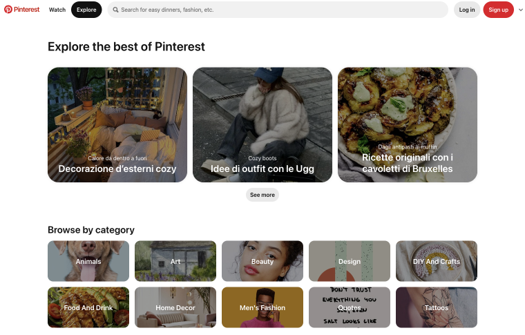
Pinterest enhances the browsing experience with lazy loading, gradually loading image-heavy pages as users scroll. This allows visitors to dive right into the content without waiting for the entire page to load, keeping the experience smooth and engaging.
3. Optimize for every device
Mobile responsiveness ensures that your WordPress site looks and performs well on any device, providing a seamless experience for all visitors. With 9 out of 10 people using mobile devices to get online, responsive design is essential.
Here are some principles of mobile responsiveness to keep in mind:
- Mobile-first: focus on key elements for smaller screens and then progress to larger ones.
- Visual hierarchy: use typography, size, and spacing to grab attention so important information stands out on all screen sizes.
- Fluid grids and images: set images to a maximum width so they fit any screen size and resize naturally.
- Typography: adjust font sizes, line heights, and letter spacing to make text easy to read on smaller screens.
- Content visibility: don’t cut out content for mobile users; repurpose it so that it displays well on all devices.
Example: Airbnb
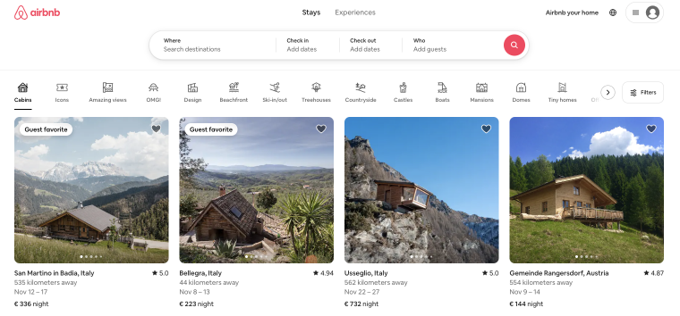
Airbnb scales beautifully from large screens to mobile devices. A fluid grid system ensures that everything – from photos to booking options – resizes smoothly.
4. Users come first
A user-focused website design prioritizes your visitors, aiming to understand how they navigate your site and fulfill their needs at every turn.
Here are a few ways to ensure your website is all about the user:
- User-centric content: focus on your audience’s needs by making your content concise, relevant, and engaging. Personalize it to connect deeply with users.
- Purpose: define your website’s purpose and design everything to support the vision.
- User experience: use tools like UXPressia to create user personas and discover user preferences.
- User research: gather insights from surveys, feedback, and analytics to guide your design decisions.
- Value: great content provides real value to visitors and helps your site stand out in search engines.
Example: HubSpot
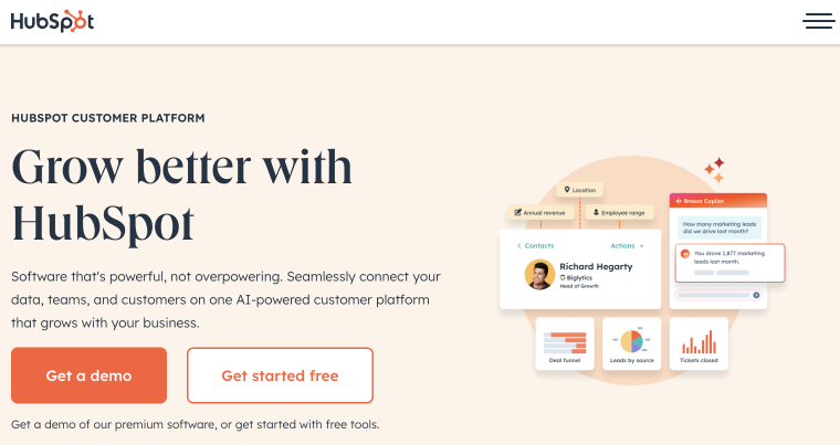
HubSpot is a great example of user-focused design. The site customizes content for different user groups and offers valuable educational resources. Clear CTAs and a logical layout help you access the necessary tools and information quickly.
5. Be consistent, be trustworthy
Brand consistency strengthens your identity by aligning visuals, content, and features seamlessly. This harmony not only makes navigation intuitive but also fosters trust, enhancing the user experience.
Here’s how you can use branding to deliver a user-friendly WordPress website:
- Visual identity: use consistent fonts, colors, and logo placement across your site to build familiarity.
- Content structure: ensure headlines, paragraphs, and blog posts reflect your brand voice.
- Visual hierarchy: use clear headings, buttons, and links to highlight important information, making it easy for users to find what they need.
- Page consistency: regularly audit your site to confirm that branding elements like logos, colors, fonts, and imagery are consistent across all pages.
- CTAs and buttons: standardize the style, color, and placement of all buttons and CTAs to improve engagement and conversion rates.
Example: Coca-Cola
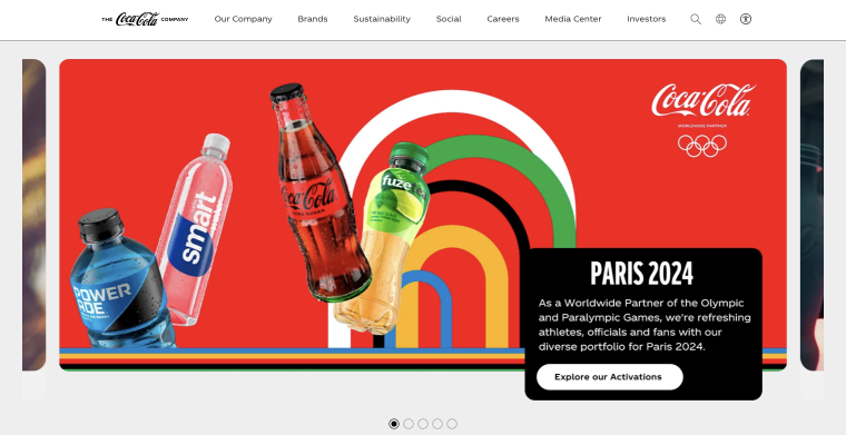
Coca-Cola effectively reflects its brand identity through its website. The signature red color, clean fonts, and iconic logo create a familiar look. Buttons and calls to action are strategically placed, and the content’s playful, refreshing tone makes it easy for visitors to engage.
6. Keep text simple and clear
Typography impacts how easily users can read and interact with your content. Proper font choices, spacing, and contrast all contribute to a website’s overall usability, especially for those with visual impairments.
Here are five ways to use typography to enhance your WordPress website:
- Simple fonts: go for legible fonts like simple sans-serifs (think Arial or Roboto).
- Font size: the body text should be at least 16px. For clear readability, make your headings stand out with larger sizes.
- Line spacing: space your lines just right—1.5 to 1.75 times the font size for smooth reading.
- Contrast: use dark text on a light background (or vice versa) for better readability.
- Font consistency: stick to two or three fonts—one for headings, one for body text, and an optional accent font for variety.
Example: Dropbox
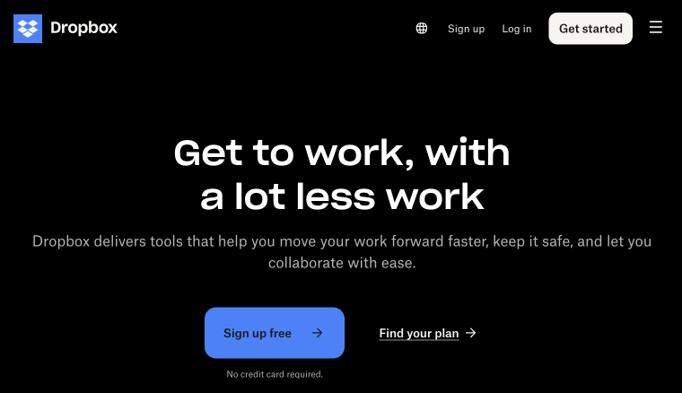
Dropbox features clear typography with sans-serif fonts, creating a modern, easy-to-read experience. Large headlines and generous line spacing enhance readability, while the contrast between the blue buttons and white background aids navigation.
7. Let your design breathe
Whitespace, or negative space, refers to the empty design areas we intentionally keep clear. It influences how easily people can read your content and focus on key elements.
Here are a few points to help you effectively use whitespace in your design:
- Readability: wider line spacing and margins around text make it easier to read and keep information organized.
- Focus: give your call to action buttons or forms extra space to stand out and attract attention.
- Navigation: enough space around menus and links improves navigation, especially on mobile devices where touch targets need to be larger.
- Visual hierarchy: use whitespace to separate sections and group related content to help visitors navigate and pick what’s important.
- Aesthetics: a clean design that incorporates whitespace gives your website a sleek, modern look.
Example: Microsoft
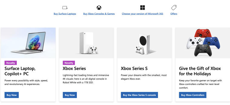
Microsoft effectively uses whitespace. There’s ample space between key sections, like product highlights and service offerings, which makes navigation straightforward. The large images and clear typography encourage readability, and the extra room around buttons simplifies user interaction without feeling crowded.
8. Include everyone, everywhere
How frustrating is it when you can’t find what you’re looking for online? Accessibility ensures that everyone, including people with disabilities, can easily use your website.
Here are five essential accessibility features to consider for a more inclusive experience:
- Keyboard navigation: ensure users can navigate using just the keyboard. Include focus indicators to guide them.
- Alt text: add descriptive alt text for all images so screen reader users can easily grasp what each image is about.
- Color contrast: keep the contrast strong between text and background colors for easy reading.
- Accessible forms: always pair form fields with labels and clear instructions to help users easily fill them out.
- Skip links: add skip links that let users jump past repetitive navigation to the main content.
Example: WebAIM
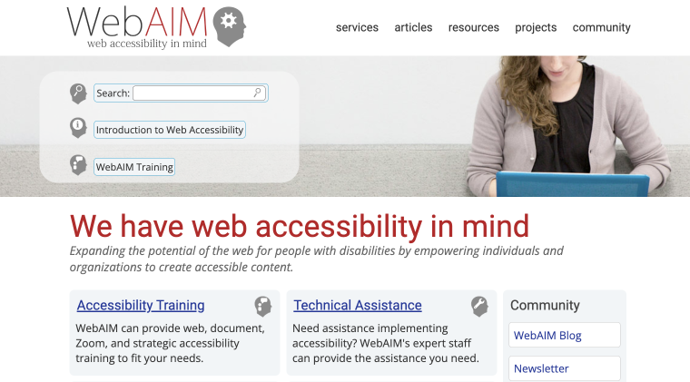
WebAIM is an excellent example of accessibility. It features clear keyboard shortcuts for navigation, descriptive alt text for images, and strong contrast between text and background colors.
9. Guide visitors to take action
Strategically placed calls to action (CTAs) direct users to their next steps. By enhancing the presentation of these elements, you can facilitate easier navigation and encourage visitors to engage with your site.
Here are five key strategies to effectively implement CTAs:
- Clarity: make sure your CTAs clearly convey the intended action. (e.g., “Sign Up” or “Download Now”). Position them contextually for better relevance.
- Strategic placement: place key CTAs at the top of the page so they’re easy to spot. Also, find ways to naturally weave them into your content for better engagement.
- Compelling copy: use action-oriented language, like “Take the first step now!” instead of “Get Started,” to invite users to take immediate action.
- Personalization: tailor your CTAs based on how each user persona interacts with your site.
- Feedback: let users know right away what they did after clicking a CTA, such as “Thank you for subscribing!” after a successful signup.
If you want to improve your CTAs, try to experiment with different wording, colors, placements, and designs. Tools like Google Optimize can help you find out what your audience responds to best.
Example: Amazon
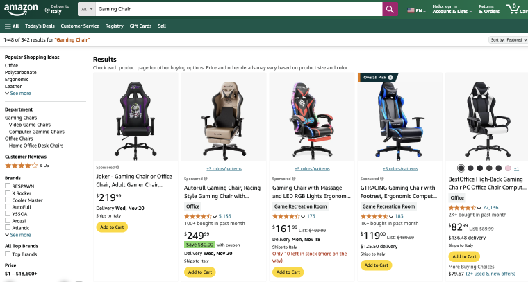
Amazon captures attention with its design. Their “Add to Cart” buttons are easy to see and well-placed, helping users quickly make a purchase. The contrasting colors really make these buttons stand out.
10. Tell your story with images
High-quality, optimized images not only elevate your site’s visual appeal but also capture your audience’s attention and maintain their engagement.
Here are a few key points to consider when incorporating images into your site:
- Visual appeal: choose high-resolution images that reflect your brand identity.
- Compression: use image compression tools like TinyPNG before uploading. Where possible, keep images under 100KB to boost loading speed.
- Naming: name your images clearly. For example, use “red-running-shoes.jpg” instead of “IMG_1234.jpg” to improve visibility.
- Visual storytelling: select images that effectively communicate your message, and consider the style and color palettes for better presentation.
- Accessibility: always include alt text for images.
Example: Nike
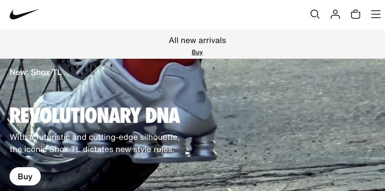
Nike exemplifies visual storytelling. It uses images that showcase its products and convey a strong brand message. The vibrant visuals invite visitors to browse and enjoy their shopping experience.
FAQ
Mobile responsiveness is significant as more than half of web traffic comes from mobile devices. A responsive website adjusts to various screen sizes for a smooth experience on smartphones, tablets, or desktops. This helps improve your site’s SEO since search engines favor mobile-friendly designs.
To make your website more accessible to users with disabilities, consider adding features like keyboard navigation, alt text for images, and high-contrast colors. These adjustments make your site more accessible for users with visual impairments.
Additionally, accessible forms and skip links can enhance the experience for those using assistive technologies. Accessibility ensures that your content reaches a broader audience.
CTAs are essential for guiding users toward actions like signing up for a newsletter or purchasing. By aligning CTAs with the user journey, you can guide visitors smoothly through each step, boost conversions, and ensure they easily find what they need.
High-quality images are important since they enhance your website’s visual appeal. Additionally, appealing visuals contribute to storytelling and effectively convey your brand message. Optimizing images for SEO increases your site’s visibility, attracting more visitors and enriching the overall user experience.
Conclusion
Yes, you can make your WordPress site more user-friendly and engaging! With careful execution, you can create a site that serves your audience and supports your business goals. Focus on usability, visual appeal, and accessibility to create a memorable experience and encourage interaction.
For a head start on design, consider using a WordPress premium theme that offers style and flexibility.
