Mega menus can be very effective navigation tools for enhancing a website’s usability – with respect to content. Creating an efficient mega menu that is both functional and user-friendly can be a real challenge, though, especially if one is new to web development or UX design. This practical guide is for WordPress users, created with input from web developers and UX designers to guide you through the pitfalls of designing and building a mega menu.
Table of Contents
- To Mega Menu, or Not to Mega Menu: That Is the Question
- Web Developer’s Perspective
- UX Designer’s Perspective
- FAQ
- Conclusion
Whether you are a WordPress developer or one fresh out of the wrapper with this content management system, these very clear tips will help you avoid common pitfalls and ensure that your mega menu actually enhances – not detracts from – the user experience on your site.
What really differentiates this guide from the others is the two perspectives given in technical development and user-centered design. Integrate these expert tips to create a mega menu that not only looks good but develops its functionalities intuitively and efficiently, improving overall navigation and user satisfaction.
To Mega Menu, or Not to Mega Menu: That Is the Question
As stated earlier, the navigation menu can make all the difference in a website’s user experience. In this section, we will run through some case scenarios to help you determine whether a mega menu or regular menu is more fitting for your site. We will cover some mega menu examples that work wonders, like in online stores or personal blogs, and when it may be just an overkill.
Online store
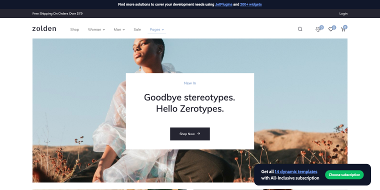
Why use a mega menu?
An online store that features numerous categories such as digital products, clothing, electronics, home goods, and beauty products. A mega menu allows these categories and subcategories to be displayed clearly and efficiently, helping users find their desired items without excessive clicking.
Why not use a mega menu?
If the online store offers only a few product categories, a regular menu would suffice. A mega menu might complicate navigation for a simple inventory, potentially overwhelming users.
News website
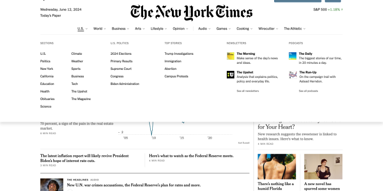
Why use a mega menu?
A news website covers various topics, such as politics, sports, entertainment, and technology. A mega menu organizes these diverse topics, making it easy for readers to find articles of interest quickly.
Why not use a mega menu?
For a local news site with limited sections, a simpler menu is preferable. A mega menu could clutter the interface and distract users from the main news content.
Educational website
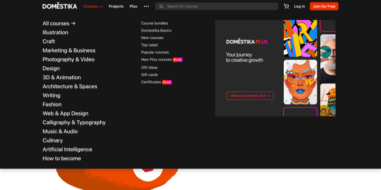
Why use a mega menu?
A mega menu can benefit an educational website serving students, teachers, parents, and administrators. It allows different user groups to access tailored resources and subcategories efficiently.
Why not use a mega menu?
If the site primarily serves a single user group with straightforward content, a regular menu is better. A mega menu could introduce unnecessary complexity.
Real estate website
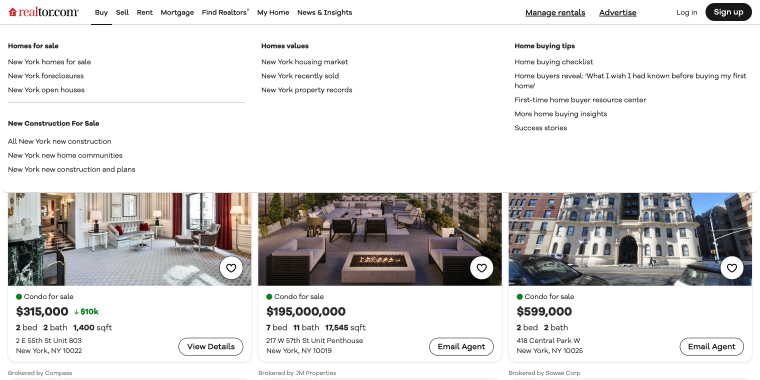
Why use a mega menu?
A real estate website can use a mega menu to showcase listings by location, price range, and property type. This provides a clear overview of options, and additional details like thumbnails and descriptions enhance the user experience.
Why not use a mega menu?
A regular menu is more suitable for a small real estate agency with a limited number of listings. A mega menu may appear excessive and slow down navigation.
Personal blog
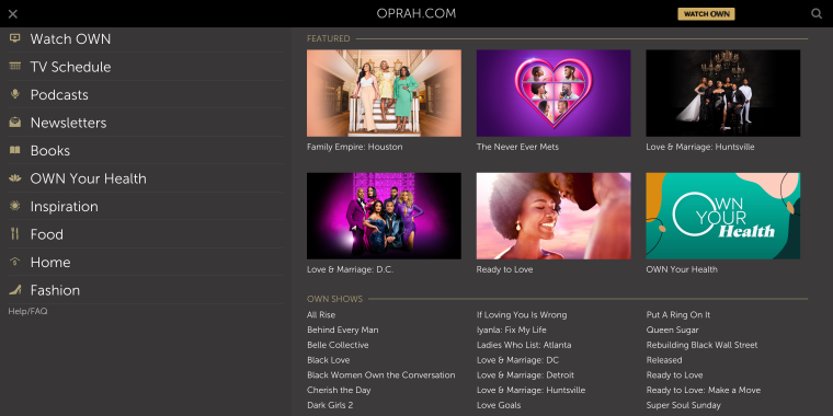
Why use a mega menu?
A personal blog generally doesn’t need a mega menu unless we’re talking about a personality with a whole media empire. In this case, using a mega menu might be the wisest choice since it has to display all the types of content and influence this person has.
Why not use a mega menu?
A mega menu might overwhelm a personal blog, making it harder for visitors to navigate the simple structure.
Restaurant website
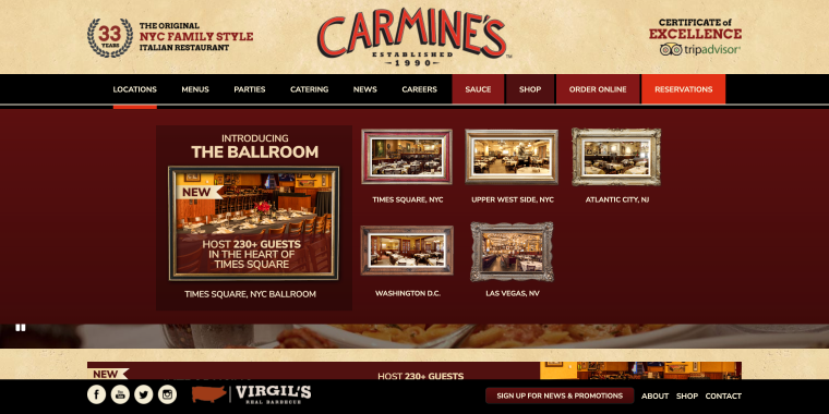
Why use a mega menu?
A mega menu is rarely necessary. A regular menu effectively covers essential information such as the food menu, location, and contact details. However, it may add interactivity and engagement if the types of food or kitchens are complemented with juicy photographs.
Why not use a mega menu?
Crocoblock WordPress developers and UX designers have provided some insight into the Dos and Don’ts of mega menus in WordPress.
Web Developer’s Perspective
Designing a mega menu requires thought toward development that enhances user experience and functionality. Quite often, developers or website owners – especially those who are new to WordPress – easily get caught in common pitfalls that can lead to cluttered and inefficient menus. They can avoid such risks simply by keeping the best practices at the forefront and using the right tools and techniques.
The following are some practical solutions for creating an effective and user-friendly mega menu by considering the key issues that a developer normally faces.
Do: Develop multi-level menus thoughtfully
Crocoblock Dev: One of the first things to consider is thoughtfully developing multi-level menus. By structuring content effectively, we ensure that users can explore extensive information without feeling overwhelmed. In WordPress, plugins like JetMenu, Max Mega Menu, or UberMenu can help manage complex multi-level or multi-column menus efficiently. One of the most frequent mega issues is that some users often forget to customize the visual elements of the mega menu.
So how do you do that? It’s important to customize the fonts, colors, sizes, and styles to match the website’s branding. Depending on your WordPress theme, you can achieve this through the Customizer, Gutenberg, or Elementor or by using custom CSS in the theme settings. Adding backgrounds, icons, and images to the menu items can also enhance their appeal and functionality.
With Elementor, you can easily customize every bit of your mega menu created by JetMenu.
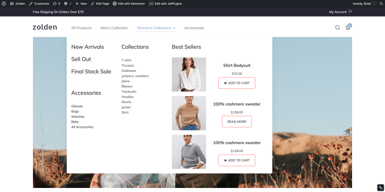
Let’s take a look at our Zolden template. It has a mega menu that fits all kinds of links referring to women’s apparel featured in this store. What’s more, it has a “Best Sellers” listing that features best-selling products.
Creating such a menu takes about 20 minutes if you have basic Elementor skills. To make things easier for you, we have a step-by-step guide for building a mega menu on your WordPress website.
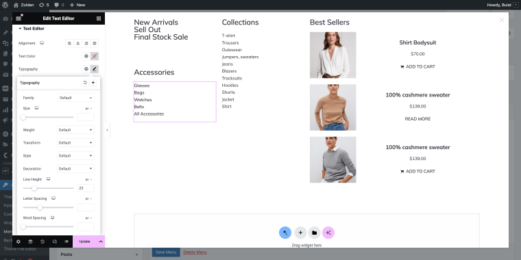
Do: Integrate with page builders
Crocoblock Dev: Another frequent mistake is not integrating with page builders.
Solution: Using tools like Gutenberg or Elementor can simplify the process of creating and editing mega menus. These builders allow for the addition of various widgets directly into the menu, boosting its functionality and interactivity. For instance, the Elementor Mega Menu widget can help create dynamic and visually appealing menus without additional plugins.
Do: Incorporate dynamic content
Issue: What about dynamic content?
Solution: Incorporating dynamic content such as shortcodes, HTML, and widgets can significantly enhance the mega menu. Custom CSS and JavaScript can be used for further customization, like opening menus with specific triggers or loading content via AJAX. WordPress plugins like Advanced Custom Fields can also be utilized to add dynamic content easily.
The website Airstream.com showcases an advanced mega menu that uses dynamic content well. When clicked, each menu item opens a large window with links and preview images leading to the main categories of campers and vans available in the inventory. This layout helps users quickly access the specific types of vehicles they are interested in.
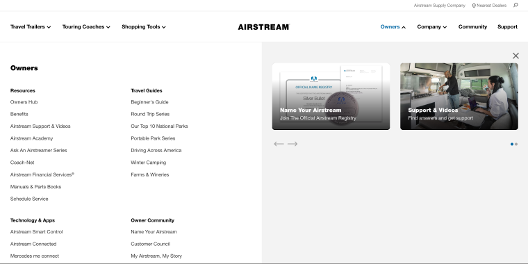
Carousels in the “Shopping Tools” and “Owners” sections to display blogs or help articles are excellent ways to incorporate dynamic content. This makes the menu more interactive and engaging for users.
Do: Mobile responsiveness is a must
Crocoblock Dev: A common oversight is neglecting mobile responsiveness.
Solution: Mega menus should work well on both desktop and mobile devices. Creating different layouts for each ensures a smooth user experience across all platforms. In WordPress, many themes come with built-in responsive design options, or you can use plugins like JetMenu to enhance mobile experience. Here’s a nice example of a website where the mega menu was nicely adjusted to mobile screens.
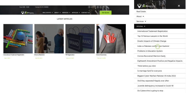
The website Aadewan.com.pk features a user-friendly mega menu that ensures easy navigation across both desktop and mobile devices. The articles in the “ARTICLES” menu section are particularly well-optimized in terms of mobile responsiveness. On the desktop, these articles are displayed with preview images and can be rotated via a carousel. On mobile, the same articles are presented as a drop-down list, ensuring they are easily accessible and readable on smaller screens.
Now, let’s talk about what to avoid.
Don’t: Possible plugin conflicts
Crocoblock Dev: Inexperienced users might face issues with plugin conflicts when using Crocoblock on their WordPress sites. These conflicts can arise when multiple plugins attempt to use the same resources or functionalities, leading to errors or site malfunctions.
Solution: Users need to understand basic troubleshooting steps, such as deactivating and reactivating plugins one by one, to identify and resolve conflicts.
It’s crucial to test for compatibility with the website’s theme and existing plugins. Testing on a staging site before implementing changes on your live site can help identify and resolve conflicts.
Don’t: Failing to minimize resource usage
Crocoblock Dev: Be mindful of resource usage, as inadequate hosting resources like RAM and WordPress memory limits can lead to performance issues. When using Crocoblock, heavy resource consumption by multiple plugins or complex features might cause your site to slow down or even crash.
Solution: Avoid overloading the mega menu with excessive animations and features, as this can slow down page load times and negatively impact performance. Utilizing performance optimization plugins like WP Rocket or Autoptimize can help maintain speed and efficiency.
Don’t: Be careful with legacy features
Crocoblock Dev: Lastly, avoid using legacy features. Using outdated or deprecated features can cause compatibility issues and make your site vulnerable to security risks. Crocoblock offers many modern and updated tools, so it’s best to take advantage of these instead of relying on older functionalities. Keeping your plugins and features up to date will ensure better performance and security for your WordPress site.
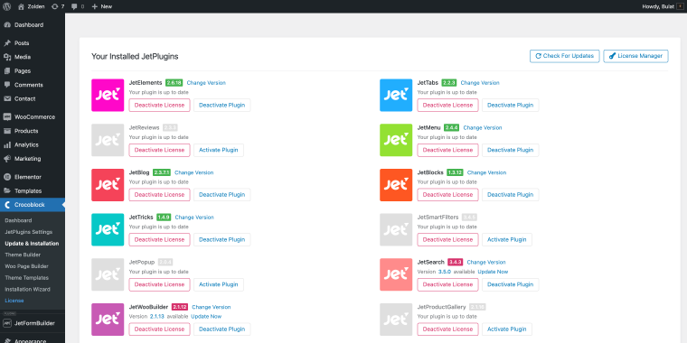
Solution: Always use the latest versions and avoid deprecated options that may lack updates or support. Regularly update WordPress, themes, and plugins to ensure compatibility and security. If you’re already a Crocoblock user, keep an eye on the available updates for your plugins. You can do this via the path: WordPress Dashboard > Crocoblock > Updates and Installation.
UX Designer’s Perspective
From the UX design perspective, the central motif is the straightforward and seamless user experience. A well-designed mega menu can improve the usability of almost any website; however, one must ensure that very common mistakes in these designs do not result in frustration.
By adhering to user-centered design principles and strategic planning, UX designers can make mega menus that are not only good-looking but also nicely working. Below are common pitfalls designers fall into and actionable solutions to help you ensure that your mega menu effectively serves users’ needs.
Do: Focus on user convenience and quick navigation
Crocoblock Designer: From a UX perspective, the primary goal is user convenience and quick navigation. Users sometimes overlook the importance of strategic placement of navigation elements and links.
Solution: Navigation elements should be in predictable locations. For instance, on an eCommerce site, the menu is typically at the top or left, with the shopping cart and user account in the upper right corner. WooCommerce offers predefined layouts that follow these best practices. Here’s an example of a WordPress website with thought-through navigation.
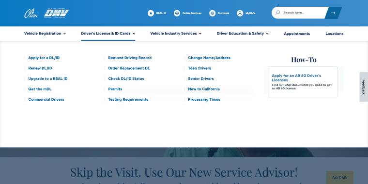
The website DMV.ca.gov exemplifies user convenience and quick navigation through its well-structured mega menu. Each main menu item opens a full-width window with links to the most critical sections, allowing users to access the information they need without unnecessary clicks quickly. This setup will enable visitors to quickly find essential information related to the Department of Motor Vehicles’ services.
Do: Maintain a clear hierarchy
Crocoblock Designer: A clear hierarchy is crucial.
Solution: Ensure that the menu design directs users’ attention to important details without overwhelming them. To prevent clutter, avoid cramming all pages and sections into the menu. WordPress menu plugins often include options to create dropdowns and sub-menus, helping to maintain a clear hierarchy.
Do: Menu labels should be short
Crocoblock Designer: Menu labels can be problematic if they’re too long.
Solution: Labels should be concise, ideally one word, to maintain readability and a clean appearance. Using tools like the WordPress menu editor, you can easily edit and test different label lengths.
AD Dal Pozzo’s website has a mega menu with one-word labels that work just right.
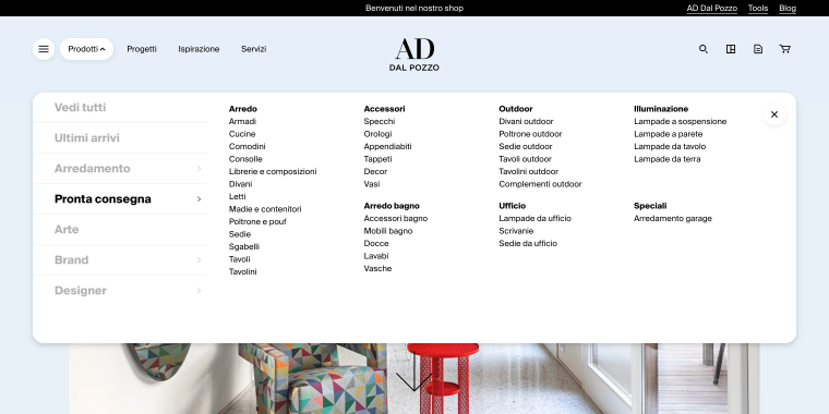
Clicking the menu item opens a mega menu layout that neatly organizes information into easy-to-navigate sections. Each section features concise, one-word labels that lead to various product categories, types, and other relevant areas. This design ensures quick access to specific items, making it simple for users to find exactly what they need with minimal effort.
Do: Include visual links
Crocoblock Designer: Incorporating visual links can be beneficial.
Solution: Adding images of key products as links within the menu can encourage exploration, making the menu functional and a tool to drive sales. WordPress plugins like Max Mega Menu support adding custom HTML and images directly into the menu structure.
Don’t: Hover initiated mega menu trigger
Solution: Mega menus should open with a single click and close when clicking outside the menu. If using a hover trigger, include a slight delay to prevent accidental openings and disruptions. WordPress plugins often include settings to customize these triggers to enhance the user experience.
Don’t: Actions in the mega menu
Crocoblock Designer: Lastly, avoid including actions like newsletter subscriptions or contact forms in the mega menu.
Solution: These actions, along with search fields, should be placed outside the mega menu to remain always visible and accessible. Use dedicated plugins or widgets for these functionalities, ensuring they are placed in appropriate areas of the website.
FAQ
Recommended plugins include JetMenu, Max Mega Menu, UberMenu, and Elementor’s Mega Menu widget. These tools help manage complex multi-level menus efficiently.
Use responsive design options provided by many WordPress themes or plugins like WP Mobile Menu to create different layouts for desktop and mobile versions.
Avoid overloading the menu with animations and excessive content, ensure compatibility with other plugins, and avoid outdated or legacy features.
Conclusion
The development of an effective mega menu that is easy to use first requires consideration of technical and design issues in a WordPress application. With these expert tips from our web developer and UX designer, you’ll be able to avoid common pitfalls when creating a mega menu.
It clearly supports navigation and improves the user experience on your site. When using plugins, custom CSS, or page builders, stick to a very fine balance between functionality and aesthetic appeal, mobile responsiveness, and features that are heavy in resources.
