Mega menus are an advanced form of a navigation menu that is generally found on most websites. They enhance the way information is displayed to the user. Mega menus usually present large and comprehensive information in a single, well-structured drop-down menu.
In this article, we’ll look at mega menus, including their definition, types, benefits, and design.
Table of Contents
- What Is a Mega Menu?
- Best WordPress Plugin for Building Mega Menus
- Technical and Design Tips
- 12 Mega Menu Inspiration Sources
- FAQ
- Conclusion
What Is a Mega Menu?
A mega menu is an extensive, multi-column drop-down menu that opens expansively within view for the user when hovering or clicking an item in the main navigation. Unlike a classic drop-down menu where items appear in one long column list, the mega menu discloses many options in a structured and visually exciting manner. Those structures can contain the elements of different types of content: text links, images, icons, and some interactive elements, such as forms and videos.
Mega menu types
There are many formats of the mega menu, all devised to enhance user experience by providing structure and an appealing navigation view. The main types of mega menus, with descriptions and an ideal use case, are as follows.
Vertical mega menu
It is best for online stores with various product categories, such as electronics, fashion, or home goods. The vertically aligned mega menu enables rapid browsing through multiple categories and, in turn, their subcategories. It is great for websites with vast, in-depth, multiple-product or service lines that clearly articulate a category and subsequent subcategories in priority and ease of use.
Structure:
- Typically, it appears on the left side of the screen.
- The main categories are listed vertically.
- Subcategories expand horizontally, often displayed to the right of the main categories.
Example: eBay
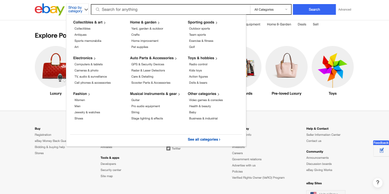
eBay’s vertical mega menu lists departments with subcategories expanding vertically, making it easy for users to navigate various products.
Horizontal mega menu
It works well for business websites that display various departments or services under a single roof, so all the choices can be viewed simultaneously. Using such mega menus, schools and universities can systematically display multiple faculties, departments, and resources.
Structure:
- Expands vertically from a horizontal navigation bar.
- It often covers a significant portion of the page when opened.
- Main categories are listed horizontally, and subcategories are displayed below them.
Example: The New York Times
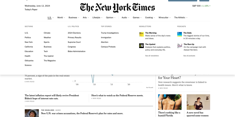
It uses a horizontal mega menu to organize news articles by sections like “U.S.,” “World,” “Business,” etc., enabling users to access the content they are interested in easily.
Tabbed mega menu
Ideal for news portals, large-scale eCommerce sites, or any websites with a large quantity of diversified content. Perfect for websites that provide a user with more than one service or product and require a user to switch among different parts quickly.
Structure:
- Contains tabs within the mega menu.
- Allows users to switch between different sections without closing the menu.
- Each tab reveals a different set of links or content.
Example: IKEA
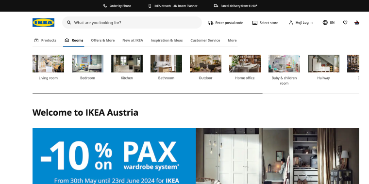
IKEA’s website uses a tabbed mega menu to organize its products and categories. When a user hovers over a main category like “Living Room,” “Bedroom,” or “Kitchen,” a large dropdown menu appears, divided into tabs such as “Furniture,” “Storage,” and “Accessories.”
Grid-based mega menu
It is the best choice for portfolios, online marketplaces, and design-centric sites where visual elements play a vital role. It is ideal for websites that highlight multiple items or projects at a time, giving a very appealing snapshot of those items.
Structure:
- It uses a grid layout to display content in a clean and organized way.
- Often incorporates images and icons to enhance visual appeal.
- Each grid cell can include text, links, and multimedia elements.
Example: Creative Market
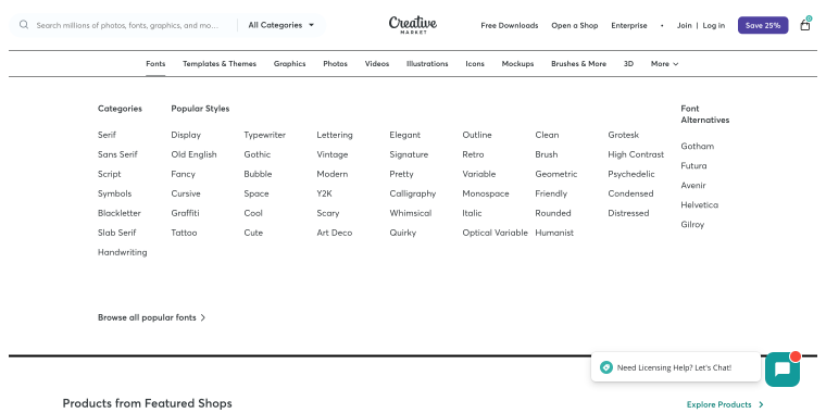
Creative Market’s grid-based mega menu showcases product categories, making it easy for users to find items visually.
Best WordPress Plugin for Building Mega Menus
JetMenu is a flexible plugin developed for WordPress that helps create beautiful mega menus and populate them with all sorts of content. It allows you to place text links, images, icons, and interactive elements such as videos on your mega menu and provides some competition for other big names on the market, such as UberMenu or Max Mega Menu.
JetMenu is powered by Elementor, which lets even those with low technical skills build a professional mega menu. With JetMenu, one can build responsive mega menus that look great on various devices.
Technical and Design Tips
Technical tips
- The mega menu must be responsive and coherent on all devices. With Elementor, you can change the menu layout using the responsive editing options.
- The time it takes to load should be optimum. Maintain minimal heavy content and lazy-load images and videos in the menu.
- Users should be able to access the menu using any assistive technology, such as screen readers. Make the mega menu more navigable with the help of ARIA roles and attributes by using assistive technologies.
- Make all the links in the mega menu crawlable for search engines. Employ semantic HTML and avoid adding too much JavaScript, which could prevent search engines from indexing pages properly.
Design tips
- Use categories and subcategories to arrange content hierarchically. Use headings to group related links together.
- The design should be consistent throughout the mega menu, including font, color, and spacing.
- When interactive elements are present, the visual feedback should demonstrate this to clarify the interaction.
- Each link or heading should be labeled clearly and concisely so as not to cause user confusion. Each link should describe the content.
- Utilize whitespace effectively to avoid clutter and make the menu easy to read and navigate.
12 Mega Menu Inspiration Sources
Marcellin College
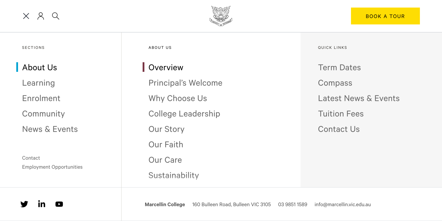
Marcellin College’s website uses a mega menu stylized with a clean hamburger button, making the interface smooth and providing a rich experience. When clicked, the menu slides smoothly from the top. It’s divided into three columns: SECTIONS, NEWS & EVENTS, and QUICK LINKS. At the bottom, users can access vital contact data and social media links, ensuring easy access to essential resources. The JS accordion ensures seamless functionality, offering a dynamic and user-friendly browsing experience.
Northstone
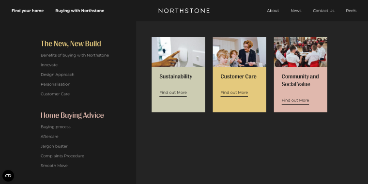
This mega menu enhances navigation without needing a traditional menu button. Clicking “Buying with Northstone” reveals the menu with a smooth, engaging effect. Covering the entire hero area, the menu is divided into two columns. The left features “The New, New Build” and “Home Buying Advice,” offering valuable information for buyers. The right showcases three cards linking to “Sustainability,” “Customer Care,” and “Community and Social Value.” It’s a modern, seamless browsing experience without cluttering the interface with contact information.
Monte Isola
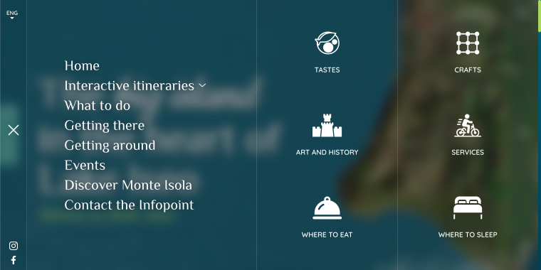
The mega menu provides an immersive navigation experience with a hamburger button that slides in from the right when clicked, covering the entire screen. It has a clean, organized layout divided into four sections. The smallest section includes a language switcher, a close button, and social media icons. The second section features links to the main pages. Sections three and four, titled “TASTES,” “CRAFTS,” “ART AND HISTORY,” “SERVICES,” “WHERE TO EAT,” and “WHERE TO SLEEP,” contain links to various site areas with minimalist icons. Instagram and Facebook links are in the lower-left corner. It combines functionality with modern design using a flexbox and frosted glass effect.
Basis
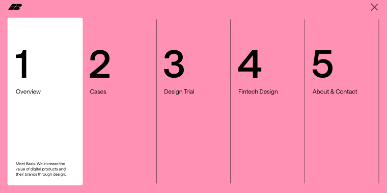
The mega menu on the Basis website offers a bold navigation experience. A superwide hamburger button triggers the menu, smoothly covering the entire screen. It’s divided into five numbered sections, each featuring a section title and a concise description. The menu’s background is Techno Pink (DC90B2), with hovered sections highlighted in white for visibility. Contact information is not included, but a streamlined design focused on core navigation elements is maintained.
Freewrite
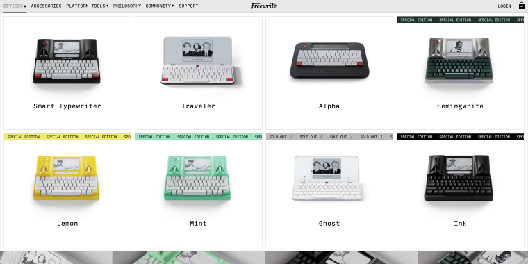
The mega menu enhances product exploration with an on-hover feature, expanding to full-width. It showcases all typewriters, each with a photo, name, and link. Some products have a creeping line indicating “sold out” or “special edition” status. Built with flex, it maintains a cohesive design with a white background and Typewriter font. Contact information is excluded, focusing on easy and informative product navigation.
Josie Fair Bijoux
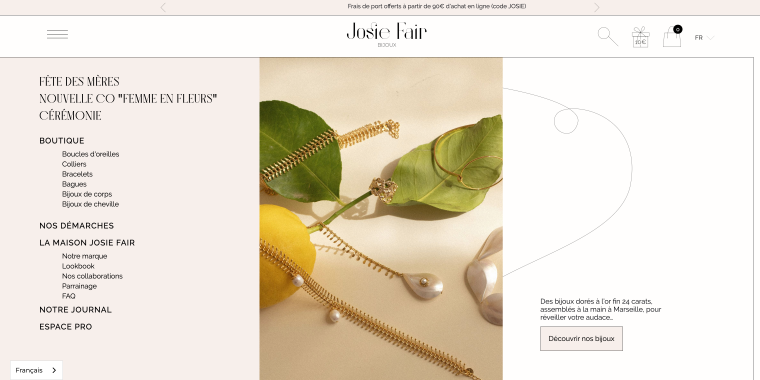
The mega menu enhances browsing with a hamburger button that reveals the menu on click. Covering two-thirds of the page, it features links to various product categories, each with a dynamic preview image. This interactive design allows users to explore products visually before clicking. The menu maintains an elegant color scheme, ensuring a seamless user experience. Contact information is not included, keeping the focus on product exploration.
Amsterdam Museum
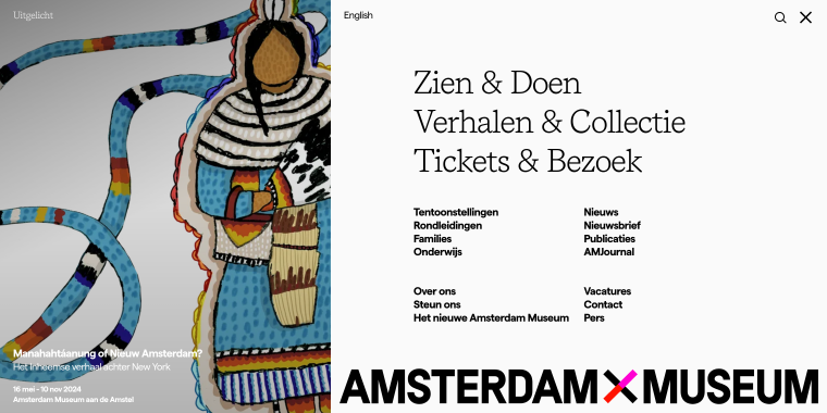
The mega menu offers a user-friendly navigation experience with a hamburger button that reveals the menu on click, covering the entire screen. The left side features an exposition with a full-height photo and basic information. The right side organizes links to all top sections, including See & Do, Stories & Collection, and Tickets & Visit. Contact information is provided as a link to the corresponding page. Built with React, it has a clean design with a white background and black text, ensuring readability and a modern look.
ILAUD
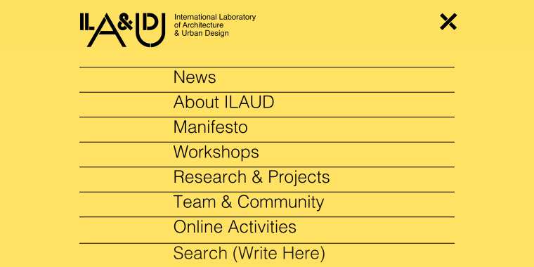
The mega menu enhances navigation with a hamburger button that reveals the menu on click, displaying links to all major sections. It is an Elementor mega menu that maintains a cohesive design with a vibrant yellow background. Contact information is not included, focusing on streamlined navigation and accessibility to primary site sections.
Skibideal
The mega menu is revealed by hovering on a top menu item, which expands to full width. It provides links to all major product categories. As an Elementor mega menu, it features a sleek black background. Contact information is not included, focusing on product exploration and category access.
You First Finance
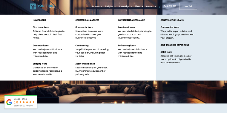
The mega menu is activated by hovering over a top menu item and expands to full width. It includes links to all major sections, with some featuring short descriptions. It is built with Elementor and has a clean white background, ensuring a professional appearance. Contact information is not included, but a focus on streamlined navigation is maintained.
Primior
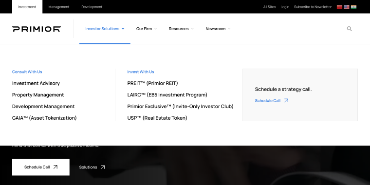
This WordPress mega menu is activated by hovering over a top menu item, which expands to full width. It includes links to all major sections, with each tab featuring a “Schedule a strategy call” link. The mega menu is built with Elementor and has a clean white background, aligning with the site’s professional aesthetic.
Anthrakitis
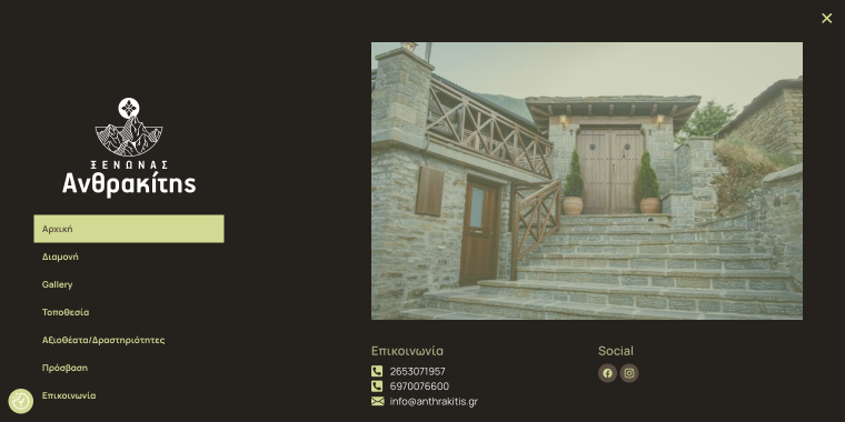
The mega menu opens with a click, featuring a reveal effect from black to visible. It includes links to key sections: Home, Accommodation, Gallery, Location, Attractions/Activities, Access, and Contact. The right side prominently displays a large hotel photo. Contact details are located in the bottom right corner. It is built with Elementor and maintains a predominantly black color scheme, ensuring a sleek and modern look.
FAQ
While mega menus are typically used on large, content-heavy websites, they can benefit smaller sites if used thoughtfully. If your site has a variety of categories or services that need to be prominently displayed, a simple mega menu can help improve navigation. However, avoid using a mega menu just for the sake of it. If your content is limited and can be easily navigated with a traditional dropdown or simple menu, it’s best to keep the design simple.
Mega menu usability is a function of various types and arrangements on a site’s content. A vertical mega menu fits like a jigsaw for an eCommerce site with too many product categories. A horizontal mega menu might be more suitable if your site offers various services or departments. For content-heavy sites, a tabbed mega menu allows users to toggle easily between different sections. Lastly, enhance the already-great display of images and icons with a grid-based mega menu for those with a more visual website. Consider your content and users when strategizing which type to use.
Yes, mega menus can be optimized for mobile devices but require careful design adjustments to ensure usability. Traditional mega menus may transform into accordion-style menus or other collapsible formats on smaller screens to save space and maintain a clean interface. Prioritizing responsive design and testing the mega menu on various devices is essential to ensure a seamless user experience across all screen sizes.
Conclusion
Undoubtedly, mega menus are a valuable tool in website navigation, particularly for content-rich and complex websites. By understanding the different types of mega menus, when to use them, and how to design them effectively, you can create an intuitive and engaging user experience. A well-designed mega menu can significantly benefit your users and your site’s overall performance, whether you’re enhancing an eCommerce site or a corporate website.