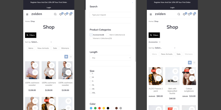
If you’ve ever built a filtered catalog that looked perfect on desktop and then checked it on your phone, you know the problem. The sidebar with 12 filters is now stacked above the product grid, taking up half the screen. Or it’s collapsed at the bottom, where no one will ever find it. Either way, the filters are technically there, but they don’t work for anyone.
The scale of the problem is hard to ignore. Mobile accounts for 60-70% of all eCommerce site visits, yet according to Baymard Institute’s 2025 benchmark, 78% of mobile eCommerce sites deliver a poor to mediocre filtering experience. Most of that gap isn’t a technology problem. It’s a layout and interaction problem that starts at the design stage.
The thing is, most tutorials explain how to connect filters to a listing. Very few explain how filters should behave on mobile, what the interaction looks like, where the filter panel lives, and how a user opens and closes it without losing their place on the page.
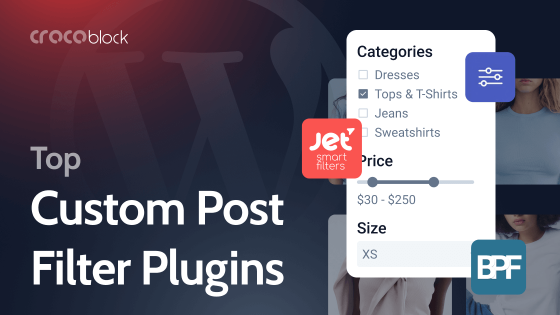
This article covers three UX patterns that solve exactly that. Each one handles mobile filters differently, suits different scenarios, and is built with a different tool from the Crocoblock ecosystem. By the end, you’ll know which pattern fits your project and how to set it up with JetSmartFilters.
Why Desktop Filter Layouts Don’t Work on Mobile
Desktop filter sidebars are built on one assumption: there’s enough horizontal space to display filters and results side by side. On mobile, that assumption fails immediately.
The typical fallback: stacking filters above the listing creates a different problem. Users have to scroll past all the filters to reach the products, then scroll back up to change a filter. On a catalog with ten or more attributes, that’s a frustrating loop. Most users won’t bother.
WordPress and WooCommerce don’t offer a solution here out of the box. The default behavior is whatever your theme does with the responsive filter sidebar on small screens, usually to collapse it, hide it, or stack it. None of those are actual UX patterns; they’re just layout responses to a narrower viewport.
The patterns in this article take a different approach: filters are hidden by default on mobile and revealed by tapping a button. The filter panel appears as an overlay or a pop-up, keeping the listing visible underneath or clearly in context. The user applies filters and returns to the results without losing their scroll position.
All three eCommerce filter design patterns work with JetSmartFilters widgets placed inside a dedicated container. What differs is the container, how it opens, and how it behaves visually.
EXTRA READING
In this guide, you can learn all the ins and outs of WooCommerce product filtering with JetSmartFilters, covering key filter types, setup steps, and best practices for seamless shopping that increases conversions and customer satisfaction.
Slide-In Mobile Offcanvas Filters
The user taps a “Filters” button, typically placed in a sticky header or a fixed bar at the top of the product loop. A panel slides in from the side, covering part of the screen. The listing is still partially visible behind it or dims slightly. The user selects filters, taps “Back,” and the panel slides back out.
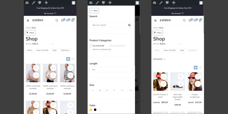
Results update.
It’s a familiar interaction, using the same mechanic found in most native shopping apps. Users don’t need to learn anything new.
When to use it
This pattern works well for:
- WooCommerce product catalogs with multiple filter groups (category, price, size, color, brand);
- custom post type archives with several filterable attributes;
- any listing where users are expected to combine multiple filters before applying.
It’s less suited for simple scenarios with one or two filters; that’s overkill for the interaction cost.
Where the trigger button lives
The “Filters” button doesn’t have to sit in a static position. One of the more practical implementations is placing it inside a sticky filter bar UX, a header, or a bar that stays fixed at the top of the screen as the user scrolls.
If you want to add a filter trigger button to a sticky bar, feel free to refer to the floating bars and sticky banners use cases.
This way, the filter trigger is always accessible, even deep into a long listing. The user doesn’t need to scroll back to the top to change filters.
How to build it
This pattern is built with a free Jet Offcanvas Column add-on and JetSmartFilters mobile filters. Go check out this tutorial on how to create filters with Jet Offcanvas and fine-tune the look of the trigger button.
After downloading and installing the add-on, you’ll get a new section, Offcanvas Settings, in the Advanced tab of the Elementor Column.
Toggle the Enable switch to turn the feature on.
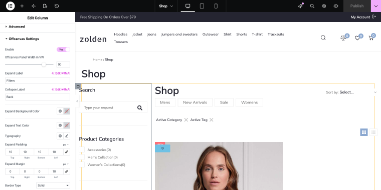
The offcanvas column will contain all filter widgets handling the slide-in behavior. All JetSmartFilters filter widgets are connected to the WooCommerce Archive created with JetWooBuilder.
That’s the easiest solution, enabling one toggle, you’ll get a mobile filters panel. Let’s go to the next pattern.
Pop-Up Overlay Filters
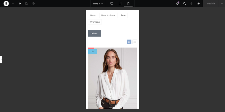
The user taps a “Filters” button. A pop-up overlay appears on the page, and the filter panel takes focus. The user makes selections. The page filters apply automatically, the products feed updates in the background, and the pop-up closes.
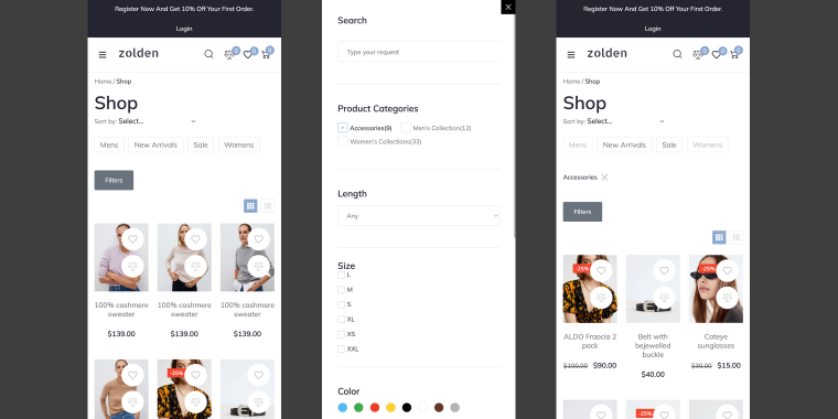
Unlike the off-canvas panel, which slides in from the side and maintains some spatial connection to the page, the pop-up is a full context switch. The listing disappears from view, and the user is entirely focused on the filter choices.
When to use it
This option is a good fit when:
- the filtering logic is complex and has lots of bells and whistles;
- the design calls for a more deliberate, modal-style interaction.
It also works well when the filter set is large enough that a slide-in panel would feel cramped, and a full-screen overlay gives more room to present options clearly.
How to build it
The pop-up is powered by the JetPopup plugin and contains all product-related JetSmartFilters filter widgets.
To create a new pop-up, go to WordPress Dashboard > JetPopup > Create new popup. In the pop-up editor, you can add as many search filters as you need.
Specifically for the mobile version, you can limit the number of pop-ups so they all fit inside the screen without scrolling.
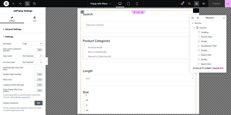
After creating the pop-up, you need to add a trigger button, open the shop template in the Elementor, Bricks, or Gutenberg editor, and add a button widget. Since we’re building filters for mobile, we need to hide the button on desktop.
After adding the button, go to the Advanced tab and scroll to the JetPopup section.
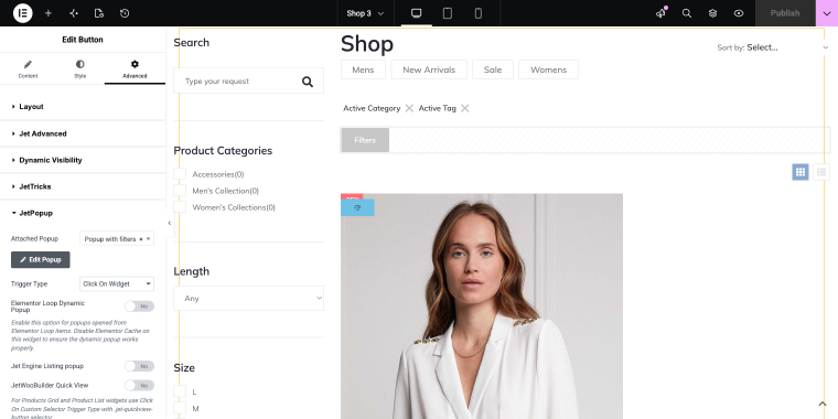
There you’ll find the Attached Popup field, where you need to choose a corresponding pop-up.
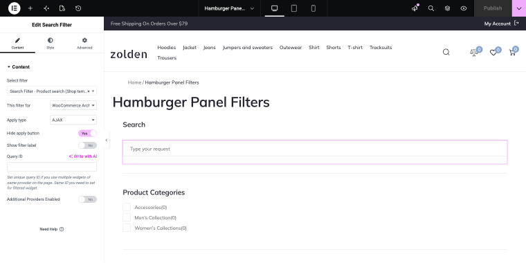
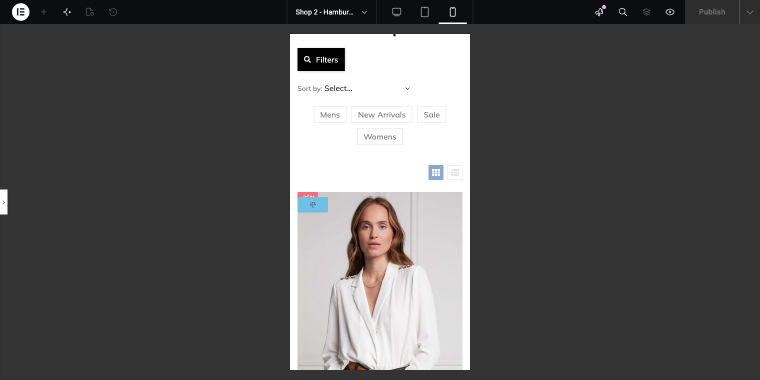
Hamburger Panel Filters
The user taps a “Filters” button, and a hamburger panel appears. You can also choose how it appears (opting for “Slide,” “Fade,” or “Zoom” effect) and where (choosing a corresponding option “Left” or “Right”).
JetBlocks Hamburger Panel can contain a full custom section template with JetSmartFilters widgets inside.
This is an easy-to-tune and flexible option (thanks to the ability to display any section template). The appearance, panel position, and content layout are all controlled through the template, so the filter panel can be styled exactly like the rest of the site, not as a generic overlay.
When to use it
This pattern suits projects where:
- visual consistency matters, and the filter panel needs to match a specific design system;
- the site already uses JetBlocks for navigation, and adding a hamburger panel is a natural extension;
- you want control over the panel appearance effect: “Slide,” “Zoom,” or “Fade,” to match the overall interaction style of the site.
It’s also a practical choice when the filter panel needs to include more than just filter widgets: for example, a heading, some instructional text, or a custom Reset button styled to match the design.
How to build it
After installing the JetBlocks plugin, find the Hamburger Panel widget in the Elementor panel and drop it into the shop template content.
In the Choose Template field, we can select a custom section template assigned as its content.
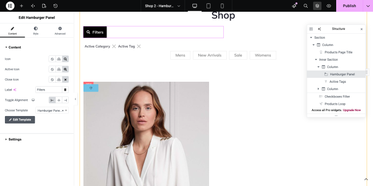
The template contains JetSmartFilters widgets connected to the WooCommerce Archive via the This filter for option.
After completing these simple steps, you’ll get a sleek mobile filters panel that’s triggered by a custom button.
Choosing the Right Pattern
All three patterns solve the same core problem, namely that filters on mobile need to be hidden by default and revealed on demand. The difference is in how that reveal happens and which project each one fits best. If you’re not sure which to pick, use this table as a starting point.
| Scenario | Recommended pattern |
|---|---|
| WooCommerce catalog, multiple filter groups | Offcanvas (built with Jet Offcanvas Column add-on) |
| Complex filtering and a modal feel | Pop-up Overlay (built with JetPopup plugin) |
| Custom design system, flexible panel styling | Hamburger Panel (built with JetBlocks plugin) |
| Filter trigger needs to stay visible while scrolling | Offcanvas with sticky trigger button |
FAQ
Filters should be hidden by default and revealed only through a deliberate user action, such as tapping a button. The filter panel should appear as an overlay, allow multiple selections, and apply them all at once before closing. This avoids constant page reloads and keeps the listing in context.
Offcanvas slides in from the side and maintains a spatial connection to the page; the listing remains partially visible. A pop-up overlay centers on the screen and fully takes focus, with the content behind it dimmed. Offcanvas suits quick multi-filter selection; pop-up suits more complex or deliberate filtering interactions.
Yes. JetSmartFilters widgets can be placed inside any container, including JetPopup templates and JetBlocks Hamburger Panel templates. Connection to the listing is handled via Query ID, which works the same regardless of the container.
Yes. JetSmartFilters supports WooCommerce product archives as filter targets. You can see this in the “This filter for” setting within the filter widget. All three patterns in this article work with WooCommerce product archives.
The Hamburger Panel pattern is a natural fit because it uses a JetBlocks widget you likely already have in the project and integrates with your existing template structure without adding another plugin to the stack.
In the End
Mobile filters aren’t a layout problem; they’re an interaction problem. Stacking a responsive filter sidebar on a small screen technically places the filters on the page, but it doesn’t give users a practical way to use them. The three patterns covered here approach it differently: filters stay out of the way until the user asks for them, and the panel that appears is intentional, closable, and connected to the results.
All three work with JetSmartFilters and differ primarily in the container and visual behavior. Choose the one that matches your project’s complexity and design requirements, then build from there. If you’re looking for broader WordPress product filter UX principles beyond mobile, the best practices for WordPress filters post covers the fundamentals.
