Creating an effective pricing table is crucial for any business offering products or services online. A well-designed pricing table not only presents options clearly but also guides potential customers toward the right choice. It helps boost conversions and improve user satisfaction. In this article, we’ll explore best practices for designing a compelling and user-friendly pricing table that simplifies the decision-making process.
I’ll also showcase examples to demonstrate how to highlight features, differentiate plans, and drive users toward purchase.
Table of Contents
- Do You Need a Pricing Table?
- The Most Popular Pricing Table Types
- Implementing Pricing Tables on WordPress Websites
- Best Practices for Effective WordPress Pricing Tables
- 5 Inspiring Pricing Table Examples by Big Companies
- FAQ
- Conclusion
Do You Need a Pricing Table?
A pricing table is a visual tool used on websites to present the different product or service plans a business offers, making it easy for users to compare features, prices, and benefits. Pricing tables on WordPress typically display a range of options, such as basic, standard, and premium plans, allowing potential customers to quickly assess which plan best suits their needs and budget.
A well-designed pricing table is essential for several reasons:
- Clarity and еransparency. By clearly listing prices, features, and benefits for each option, a pricing table helps establish trust and transparency.
- Guides customer choices. Pricing tables are structured to guide users in selecting the best plan, often by visually emphasizing a “recommended” or “most popular” option. This makes it easier for users to make quick, informed decisions.
- Increases conversions. When potential customers can easily understand the value of each plan, they’re more likely to convert. Pricing tables can highlight the best value or most comprehensive plan, helping drive sales toward higher-tier offerings.
- Improves user experience. A streamlined and easy-to-understand pricing table enhances the overall user experience by reducing confusion and making information accessible.
- Boosts perceived value. By showing different options side by side, you can demonstrate the added value of higher-priced plans, motivating users to consider features they may not have otherwise thought of.
So, a pricing table is an essential element of your website that serves as a roadmap, helping users navigate their choices and providing a direct path to purchase. It’s a strategic tool that can increase user engagement and drive conversions.
The Most Popular Pricing Table Types
Pricing tables come in various types, each tailored to highlight specific aspects of a product or service and guide users to the best option for their needs. In the forthcoming paragraphs, you will find some common types of pricing tables and how each works to support customer decision-making.
Comparison pricing table
A comparison table presents multiple plans side by side, allowing users to easily compare features, pricing, and benefits. This type is ideal for businesses with tiered service levels, such as basic, standard, and premium.
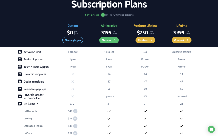
This type of pricing table is great for SaaS companies, subscription services, and eCommerce sites that offer multiple product packages.
This layout helps users quickly assess differences between plans, making it easier to choose the one that best fits their needs and budget.
Tiered pricing table
Tiered tables group products or services into ascending levels based on features and pricing, with each plan building on the previous one. Often, these tables highlight the “best value” or “most popular” option to guide users toward a mid or higher-tier plan.
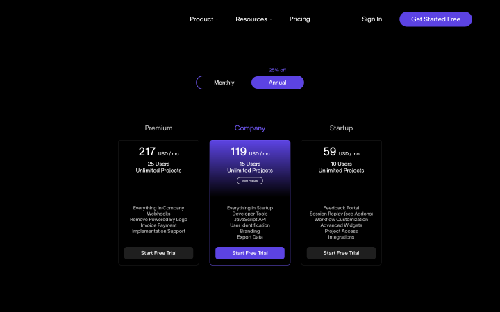
It is great for service-based businesses, as well as for online courses and tools with incremental benefits.
Tiered pricing tables emphasize value, encouraging users to opt for plans that prove to be more beneficial.
Feature-based pricing table
This type organizes plans based on key features rather than price alone, listing each feature across different plans. Often, users can see what unique features come with higher-priced options, which helps them identify the best match based on functionality.
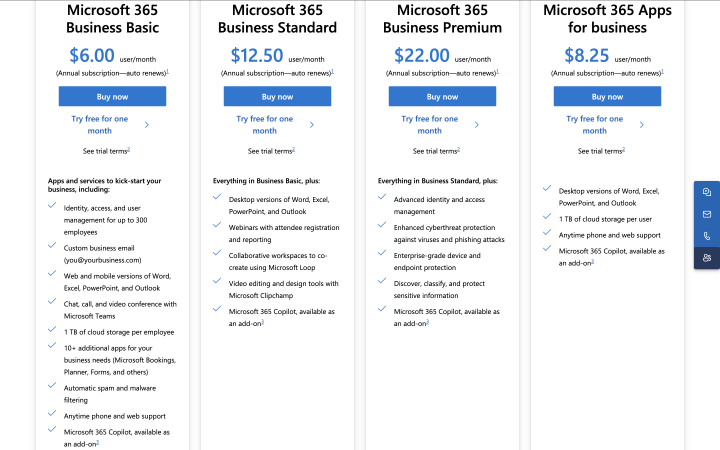
This type works for products with distinctive features that significantly impact user experience, like design software or project management tools.
Feature-based tables are especially helpful when features vary significantly, as they focus the user’s attention on what they gain with each plan.
Single-option pricing table
Instead of displaying multiple plans, a single-option table focuses on promoting a single product or service with a clear price and feature list. Often used for standalone products, these tables can also include add-ons or customizable features.
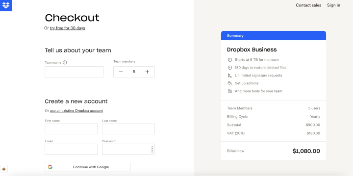
You can use such a layout for one-time purchase products, single-service offerings, or landing pages for specific product promotions.
This pricing table simplifies the decision-making process by focusing on a single choice, which can reduce decision fatigue for users and increase conversion rates.
Modular pricing table
Modular pricing tables allow users to customize their packages by selecting specific features or services. Instead of predefined plans, users can build a custom solution based on their needs and budget.
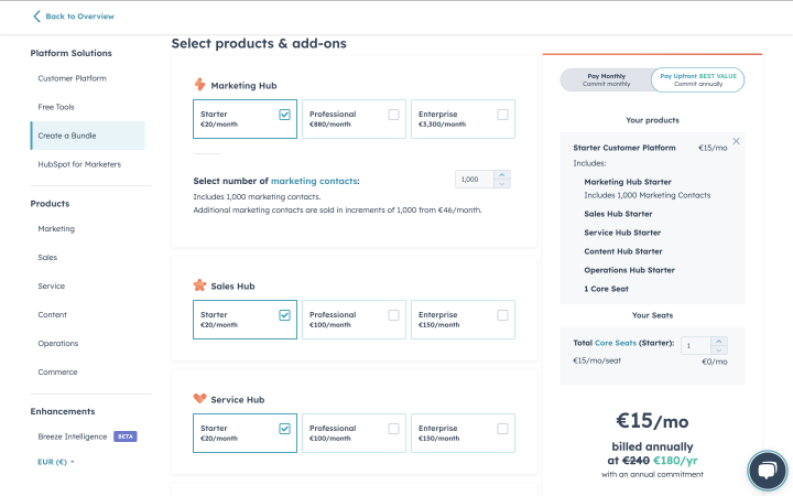
It works for businesses that offer customizable solutions, such as cloud hosting services or marketing platforms.
Modular tables provide flexibility and personalized options, making them attractive to users with unique or varied requirements.
Choosing the right pricing table type allows you to present information effectively and guide users seamlessly toward the best options.
Implementing Pricing Tables on WordPress Websites
Implementing pricing tables on your WordPress website can be an effective way to display various pricing plans, products, or services in an organized and visually appealing way.
You can create pricing tables manually in WordPress using the built-in block editor or HTML. You can style the table with CSS to match your website’s design. You also have a more convenient option: using a special pricing table WordPress plugin for this task.
For example, JetProductTables from Crocoblock. Here’s how you can use it to create responsive and customizable pricing tables.
What is JetProductTables?
JetProductTables is a powerful plugin that allows you to create advanced product and pricing tables with ease. It provides a user-friendly interface to design tables for your website. While primarily designed for displaying products, JetProductTables also allows you to create detailed, interactive, and visually attractive pricing tables for your services or subscriptions.
How to implement pricing tables using JetProductTables
- Install and activate JetProductTables. First, you need to install the JetProductTables plugin on your WordPress website. You can do this by navigating to the Plugins section of your WordPress dashboard, finding the Crocoblock dashboard, and searching for “JetProductTables.” Install it and then click “Activate.”
- Create a new table. Once activated, you’ll find a new JetProductTables option in your dashboard. Click on it, and then select “Add New Table” to begin creating your pricing table.
- Add table content. Now, you can start building your table by entering the relevant information. This tutorial will guide you in creating the table structure. While in this tutorial, you will find a detailed overview of each table setting.
- Customize the table design. Adjust fonts, colors, borders, and alignment to match your website’s overall aesthetic. You can also adjust the layout for mobile devices to ensure your pricing tables are responsive.
- Add the table to the necessary page.
Best Practices for Effective WordPress Pricing Tables
Pricing tables are a powerful tool to clearly present your offerings, simplify decision-making for your customers, and boost conversions. To make sure your pricing tables are not only visually appealing but also effective, follow these best practices:
Keep it simple and clean
A cluttered table can overwhelm potential customers. Keep the design clean with clear labels and minimal distractions. Use plenty of white space to separate different sections and ensure your pricing table is easy to read.
Highlight your best plan
Whether it’s the most popular, most valuable, or best-selling option, highlight it to draw attention. Use visual cues like a contrasting color, a larger font, or a “Most Popular” label to make this plan stand out. This helps guide customers toward the plan you want them to choose.
Be transparent with pricing
Avoid hidden fees or confusing pricing structures. Clearly state the cost and any additional charges, such as taxes or setup fees. Transparency builds trust with potential customers and helps prevent cart abandonment.
Use clear and concise descriptions
List the features of each plan in a clear, easy-to-scan format. Use bullet points to break down the details, and avoid jargon or overly technical terms. Customers should be able to quickly understand what each plan offers.
Incorporate a strong call to action (CTA)
Each pricing plan should have a clear call to action, such as “Sign Up,” “Buy Now,” or “Get Started.” The CTA should be prominently placed and easy to find, ideally in the same location on each plan for consistency. Ensure the button is visually distinct.
Limit the number of options
Offering too many choices can confuse potential customers. Limit your pricing plans to three to four options, ensuring each provides a distinct value proposition. If you have more options, consider grouping them or simplifying the offerings.
Ensure mobile-friendliness
A large portion of users browse websites on their mobile devices. Make sure your pricing tables are responsive and easy to navigate on smaller screens. Test the table’s layout and functionality across various devices to ensure it works seamlessly.
Include social proof
To reinforce the value of your plans, consider adding testimonials, ratings, or trust badges (such as security seals or money-back guarantees) near the pricing table. This helps build trust and can nudge users toward making a purchase.
Use contrasting colors and fonts
Visual design matters in a pricing table. Use contrasting colors for your headings, CTAs, and background to make them stand out. But be careful not to go overboard with too many colors. Stick to your brand’s color palette to maintain consistency.
Make it easy to compare
Ensure your pricing table is designed for easy comparison between plans. Organize information logically and use visual cues like icons or colors to differentiate between plans’ features. The user should be able to quickly scan and understand the differences.
Test and optimize
Continuously test and optimize your pricing tables to see what resonates best with your audience. Run A/B tests to compare different layouts, wordings, and CTAs. Pay attention to conversion rates and adjust based on performance.
These best practices will help you create pricing tables that not only showcase your offerings clearly but also increase user engagement and boost conversions.
5 Inspiring Pricing Table Examples by Big Companies
Big companies often lead the way with well-designed and effective pricing tables. Here are some inspiring examples of pricing tables from renowned brands that can serve as valuable inspiration.
Shopify
Shopify, a leading eCommerce platform, uses a straightforward pricing table to display its subscription plans.
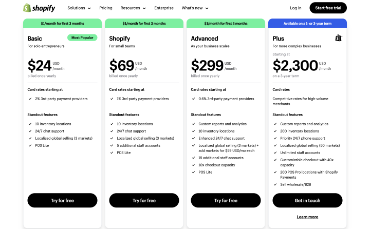
Why it works:
- Simple layout. Shopify’s pricing table clearly lays out the basic plans (Basic, Shopify, Advanced, Plus), with each plan’s features and prices listed side by side.
- Clear CTA. The “Try for free” button is prominently displayed, encouraging immediate action.
- Highlighting the Most Popular plan. Shopify highlights its most popular plan, using inscription to make it stand out.
- Concise descriptions. Each plan includes a straightforward list of key features, allowing potential customers to compare options with no sweat.
Netflix
Netflix’s pricing page uses a minimalist design to showcase its three subscription plans: Basic, Standard, and Premium.
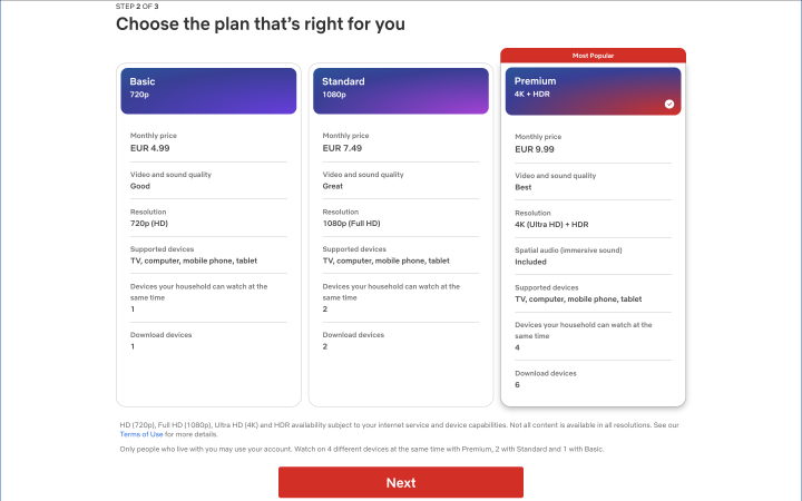
Why it works:
- Visual simplicity. With large, easy-to-read text and simple icons, Netflix keeps the pricing table uncluttered.
- Clear pricing. Pricing is displayed upfront and is transparent.
- Focus on features. Instead of a lot of text, Netflix uses images to represent key features like “HD” and “Ultra HD,” making it easy for customers to understand the value of each plan.
- Highlighting the Most Popular plan. The “Premium” plan is highlighted to guide users toward it, often increasing conversions.
Trello
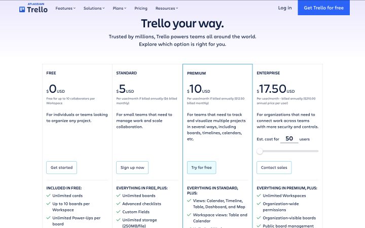
Trello, a project management tool, features a pricing table that showcases its free and premium plans.
Why it works:
- Simple design. Trello also uses a clear design with feature descriptions.
- Flexible options. The plans include monthly and yearly payment options, allowing customers to choose what suits them best.
- Free trial. There’s an easy-to-find option for a 14-day free trial, encouraging users to try out premium features.
Basecamp
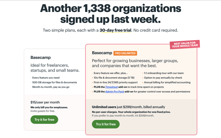
Basecamp, a collaboration software, presents a simplified pricing structure with a single price for businesses.
Why it works:
- Simplified pricing. Basecamp offers two straightforward plans. This eliminates confusion and helps users make decisions quickly.
- Design. Bright colors and highlighting the most popular offer help users make quick decisions.
- Clear value proposition. The table emphasizes that this one plan includes everything, which works well for customers who want a no-fuss solution.
- Concise CTA. The “Try it for free” button is large and bright, with a focus on simplicity.
Mailchimp
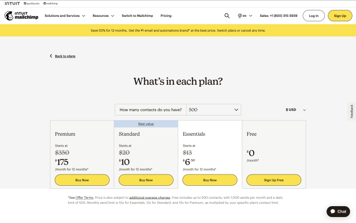
Mailchimp, an email marketing platform, presents its pricing in a dynamic table format that adjusts to the user’s needs.
Why it works:
- Interactive features. Mailchimp’s table allows users to choose the number of contacts, making it easy to compare pricing based on different needs.
- Best value. The best value plan is highlighted to help customers make decisions.
- Clear breakdown of features. Features are broken down into specific categories, such as “Email Marketing,” “Analytics,” and “Automation,” making it easy for customers to see the benefits of upgrading.
These examples show how top companies effectively design their pricing tables to guide users toward making decisions.
FAQ
While you can manually create tables using WordPress’s built-in editor or custom HTML, using a plugin like JetProductTables or TablePress can save time and offer extra features such as customization options, sorting, and easy updates. Plugins are especially helpful if you’re handling many pricing options.
To highlight your best plan:
1) Use a contrasting background color or border for the plan.
2) Add a “Most Popular” or “Best Value” label.
3) Make the call-to-action button more prominent (e.g., larger or a different color). These techniques draw attention to the plan you want to push and help guide customer decisions.
The best practice is to include 3-4 plans in your table. Offering too many plans can overwhelm users, while too few might not provide enough choice. Focus on clearly differentiating between the options to help users quickly understand which plan best suits their needs.
Conclusion
Pricing tables are a crucial element of any website that offers multiple products or subscription plans. Clearly showcasing your offerings, highlighting key features, and guiding your customers with a well-structured layout help them make informed decisions faster and more confidently.
Whether you choose to design your own tables or use a plugin like JetProductTables, remember that simplicity, transparency, and clarity are key.
Take the time to test and refine your tables, ensuring they always reflect the value of your product or service.

